Dropps: Homepage Redesign
My Role: UX & Creative Direction, UX Designer, Retouching, Photo Art Direction
Dropps was in the midst of a brand redesign. I had done a full site audit, identifying the most important areas of the site which needed improvement. Knowing we would need to do a full redesign of the website in the near-future, I took steps to focus on the most important part of the site first—the homepage, with a heavy emphasis on anything above the fold. For new customer acquisition, reducing bounce rate of the page with highest-traffic was crucial, and the existing page needed a lot of improvements.
Some Background Context…
When I started Dropps in July 2020, “pandemic fatigue” was a thing. It was exhausting, all-encompasing, and emotionally draining. Most ecommerce websites had been mentioning Covid-19 safety and shipping delays for months. By summertime, the supply chain and inventory shortages had been much improved across the country, and grocery stores had full shelves again. Things were not back to normal, but people had begun adjusting to this new way of life.
My Design Approach
First, fix the most viewed part of the page as quickly as possible, requiring the least amount of development—the content above the fold. This would help viewers understand the brand, and lead to higher interaction with navigation and scrolling the page. Next, address the body of the page by working with stakeholders to understand key messages being used to market the product, and remove content that is outdated or confusing. Lastly, a full redesign to align with new branding and overhauled value propositions.

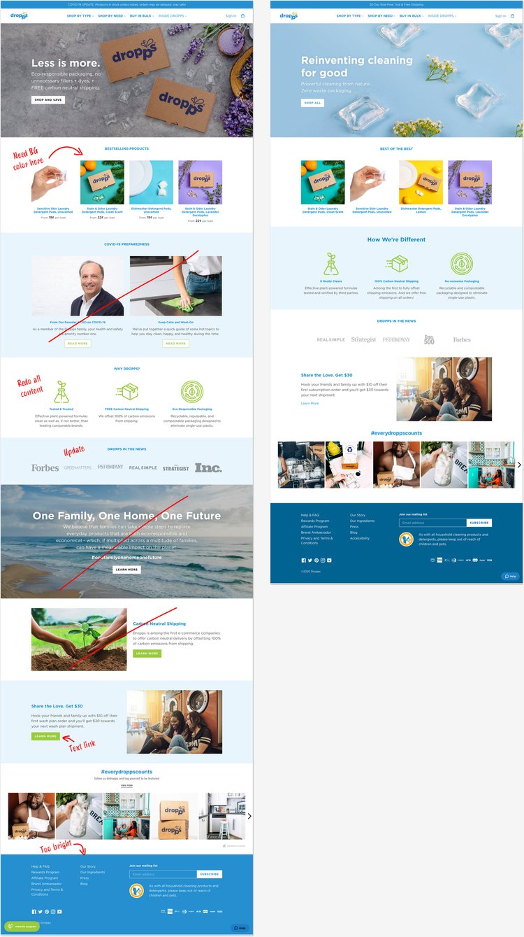
The original homepage did not state what Dropps sold.
The hero image and text implied “eco-friendly, discount-rate cardboard boxes” and the product grid was hard to decipher.
Messages about Covid-19 read like warnings to avoid purchasing rather than incentives to buy, and the content in the body of the page did not focus on product benefits.
Step One:
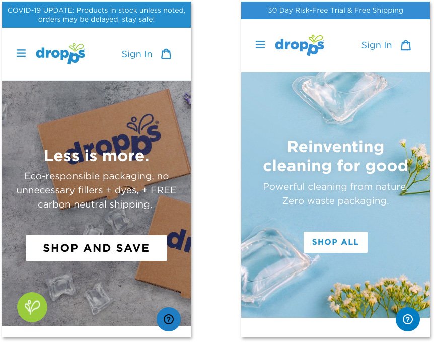
“Above the Fold” Quick Fix
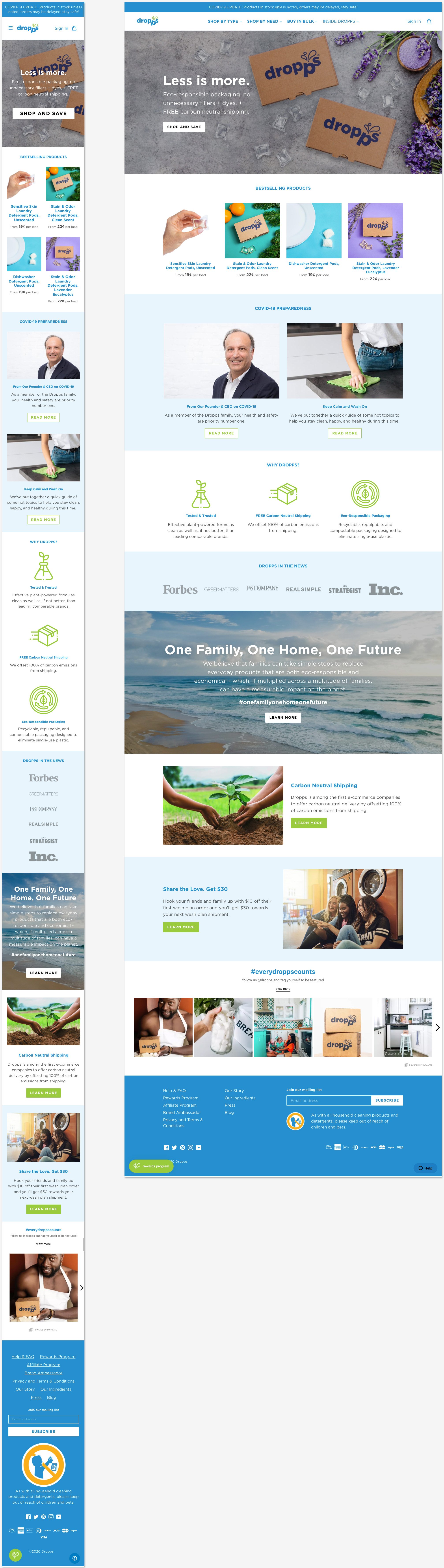
Mobile Before vs. Mobile After:
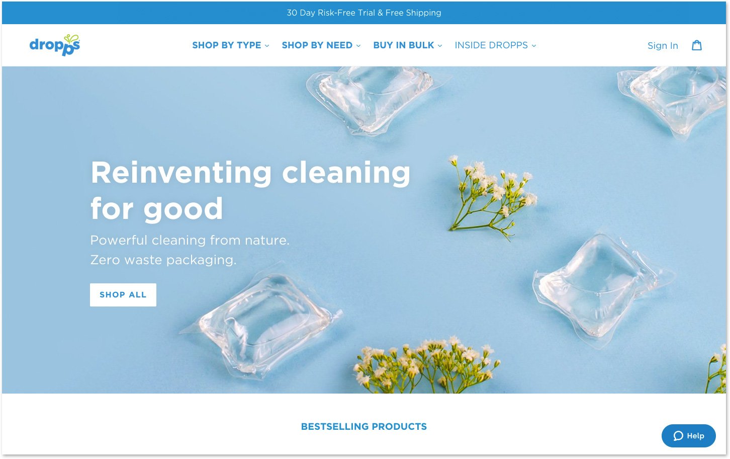
Desktop Before:
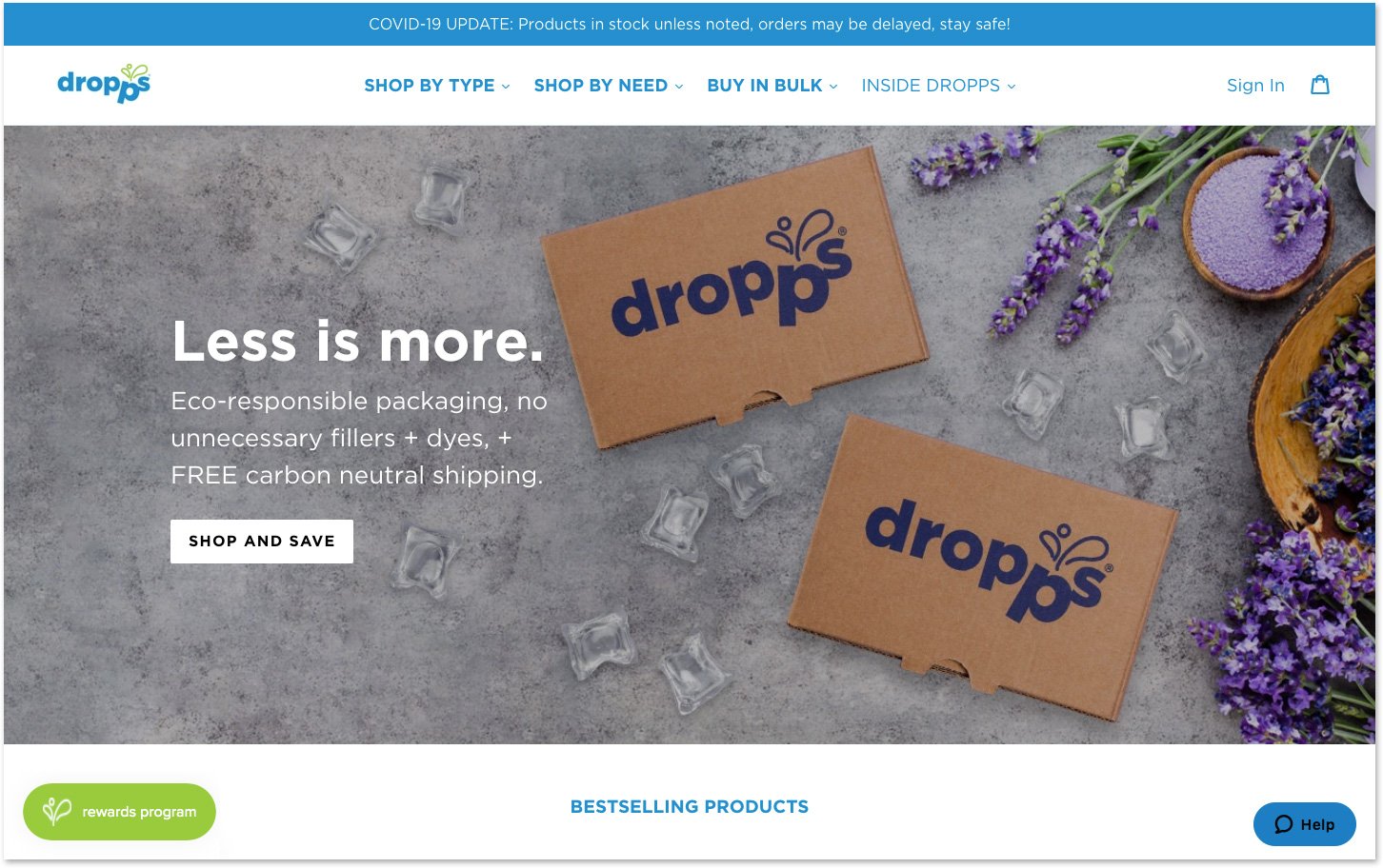
Desktop After:
Step Two:
A/B Test Streamlined Content