Rothy’s: Product Launch Campaign
My Role: Direction, Designer (Web UX & Visual Design)
Marketing Designer: Ashlee Rice
Social Media Manager: Lacey Young
Copywriter: Ann deSaussure
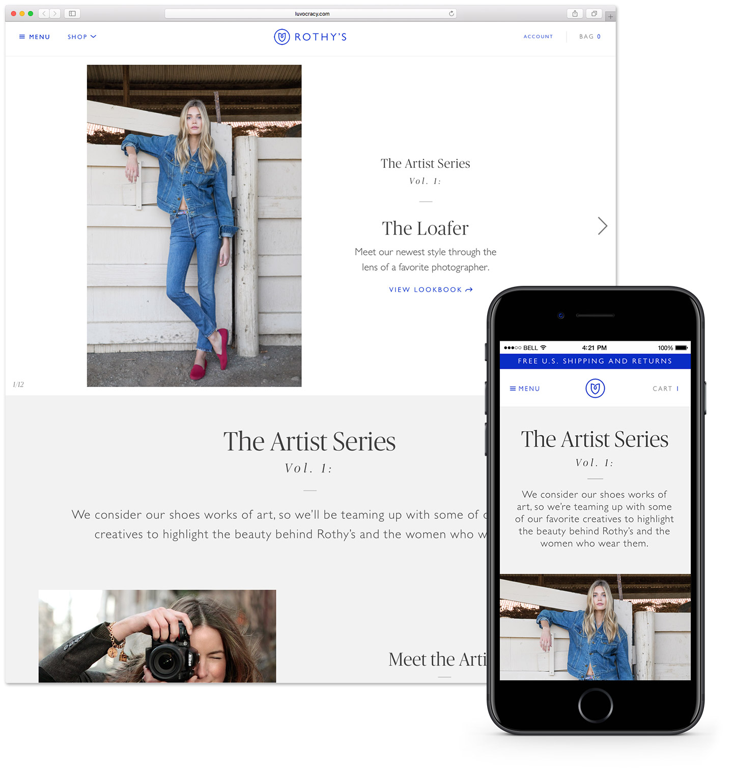
Rothy’s was launching a new shoe silhouette, and celebrated this milestone moment by hiring world-renowned portrait photographer Claiborne Swanson Frank to capture the brand in her own aesthetic, and speak to why the brand resonates with her. To showcase this content on the site, a lookbook feature was going to be created for the first time, as well as a Q&A with the artist. In addition, an idea of turning this content into a recurring “Artist Series” campaign came about, keeping the door open for other artists to share their take on the brand. In addition to the artist’s interpretation of the brand, we wanted to showcase the shoe in the Rothy’s brand aesthetic with our ongoing studio photography.

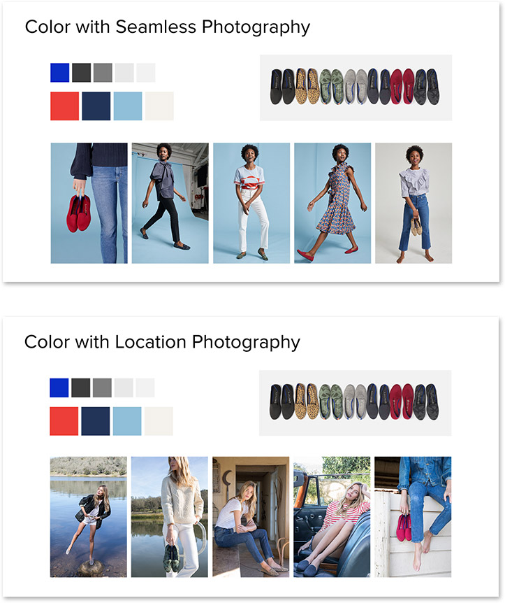
The launch campaign was to include a mixture of studio and location photography.
When pulling together the content for the website, and working with the marketing designer to plan out newsletters, it became clear we had three strong messages to communicate—new shoe (the Loafer), new feature (the Lookbook), and new program (the Artist Series)—and two differing styles of photography to utilize. I came up with a gameplan to sort out the details of how the project would flow over it’s 2-week run, giving us both structure to work quickly and in tandem. The primary focus would be on announcing the new shoe, with the Artist Series as supplemental support.
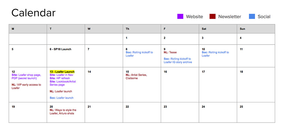
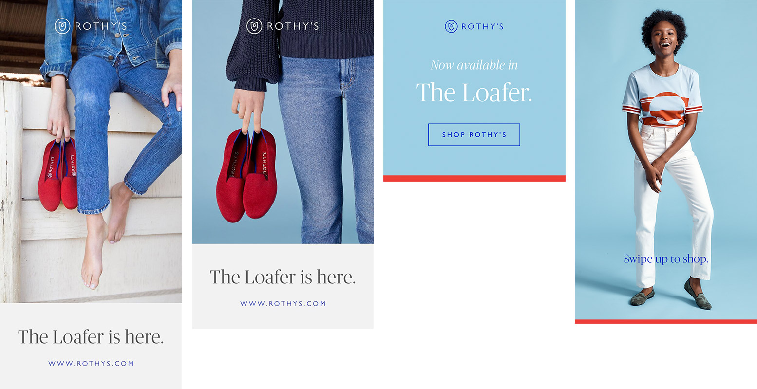
The campaign would span two weeks across site, newsletter, social and ads.
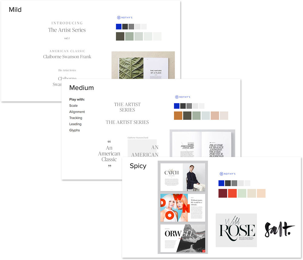
I began by compiling assets for the web landing page and lookbook, and in tandem the marketing designer worked on styleguide explorations, and plotted photography for each of the email newsletters. We talked about design direction, and had a couple of routes to consider—keep it in line with the Rothy’s style guide (same fonts and color palette), or modify the style guide to support the guest photographer’s look and feel.
I tasked the marketing designer to take a “mild/medium/spicy” approach to her design explorations (including new fonts, colors, and design elements, and we tossed around the idea of a unique branded treatment for the “Artist Series” as a program initiative), so that we might present ideas to the executive team and define how far astray from our usual look & feel we wanted to go.
Exploring different design directions resulted in elements that would tie the photography and featured shoes together, and keep the look on brand (but with a slight kick).
I started the landing page by referencing the graphic design explorations to determine what would work best for web while remaining cohesive with our pattern library.
Once we landed upon an approved design direction, I worked with the marketing designer to identify some of her stronger design flourishes, and how to tie them in with different photography styles. Ads, social posts and Instagram stories riffed off the styles and messaging established in the newsletters.
Pops of the new campaign colors, use of lines (referencing Rothy’s shoe designs), and blue seamless backgrounds tied the photography together.